

Ten years ago, I started designing book covers. HarperCollins had sent me the manuscript for Janice Pariat’s The Nine-Chambered Heart, a novel about nine characters constructing in bits and pieces the kaleidoscopic portrait of a woman they had known. I read it and immediately had the idea for something very literal, floating ventricles like clouds of translucent water-coloured blood stains. I loved the conversations and back-and-forths I had with the author and the publisher, and to this day I still enjoy seeing it fortuitously in bookshops, like meeting an old friend you haven’t thought about in a while.

Not that the process is always frictionless, like anything involving art direction and multiple stakeholders (as the vampires say), but designing book covers is one of the most enjoyable part of my work. It is the first thing a reader will see about the book. If they have no idea who the author is, it is the first impression they will have of it, as if the words inside had picked that jacket to reach the eyes and hearts of their readers. The best covers add a layer of meaning before the reader encounters a single line of text, they illuminate something essential about a book that the title alone cannot convey. The cover becomes a form of criticism or commentary, a dialogue between designer and author that enriches the work.
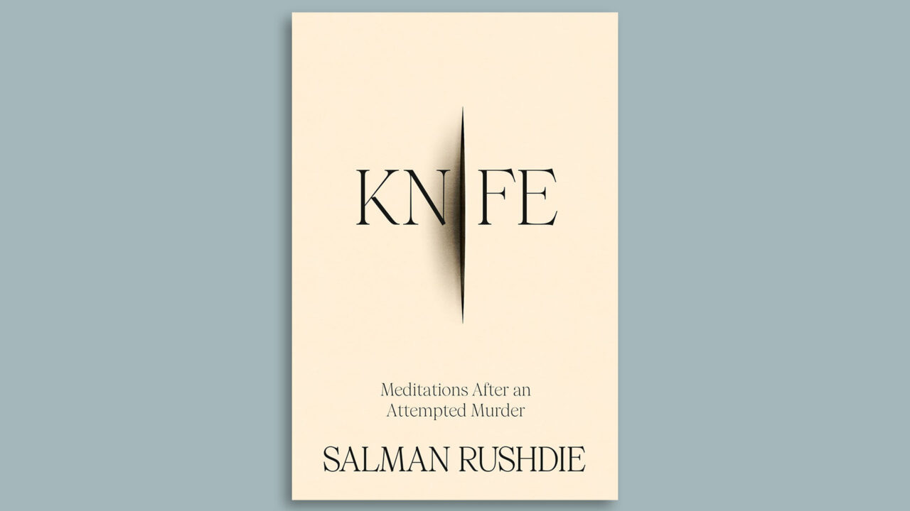
Take for example this great cover from last year, Salman Rushdie’s Knife: Meditations After an Attempted Murder, designed by Arsh Raziuddin.
Or this stunning cover for the recently published The Sisters by Jonas Hassen Khemiri, designed by Rodrigo Corral.

Book cover design is a bit like sampling in music production. Each borrows from a collective reservoir of genre tropes, and the skill lies in making those quotations resonate freshly, or be dissonant to unsettle readers.
I love how this is done by designer Chris Ferrante for the book cover of Alyssa Battistoni’s Free Gifts: Capitalism and the Politics of Nature, also published last year by Princeton University Press. He takes the reference to a 17th century Flemish nature morte by Frans Snyders, and places it against an aggressively synthetic cerulean, with the flat quality of a colour picked from a design software palette. Something akin to a default desktop background or the blue of a hyperlink. The collision is between this blue and the sumptuous earthy tones of Snyders painting, but also between these colours and the topic of the book—environmental theory and politcs, one we are more used to expect in shades of green.

Designing illustrated book covers does not mean I do not like the elegance of Gallimard’s Collection Blanche, or Adelphi’s Piccola Biblioteca and Suhrkamp’s TW iconic and unchanged cover designs. But I do resent the idea—fading, I hope—that more designed covers are pulpy marketing ploys, while true literature speaks for itself and does not need the artifices of art and creative typeface. Sobriety is a design choice. The classic French approach, for example, with its cream covers and restrained typography, is just as much a form of packaging as a lurid thriller cover. It simply packages differently, signals literary seriousness and intellectual prestige. The claim to being above commercial considerations is itself a commercial strategy.

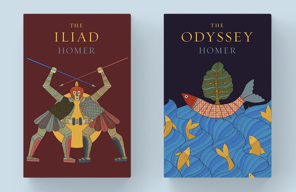
Book covers can also be a way to bring a new perspective on a text we may think we know everything about. When HarperCollins India asked me last year to design covers for their new editions of Homer’s Iliad and Odyssey, I took inspiration from the art of the Gond, an adivasi community from central India. It was a way to wrestle these myths away from history and emphasise their universality, a bit like what Peter Brook had done in his epic staging of The Mahabharat, with actors from across the world to play Pandavas and Kauravas.
I certainly do not judge books by their covers in the metaphorical sense, but we should judge literal books by their literal covers.
Have you ever just picked up a book because of its cover? Which ones? Let me know in the comments.
Thank you to everyone who ordered the calendar! I have loved receiving photos of it filled up with notes and scribbles. Make sure you leave space in it for moments of tranquillity.
I don't usually consider books by covers, but I really like the cover of Perfection By Vincenzo Latronico. We already had it at home, but I find it so striking and it fit the book so well.
As far as other covers, I've always liked The Godfather and a Lord of the Rings version (the one that is a green forest with the mountain in the background). Though maybe that's because I liked the books and movies so much.
A very interesting write-up on book covers. And certainly a pleasure to see such covers, specially the one of “ the sisters”. While I don’t judge a book by its cover, I think that an expressive cover does create an eagerness to read the book, and has its own impact. An example is the cover of the book “ Why did the Heavens not darken?”, a book dealing with the Holocaust. Not only does the title of the book speak for itself, but the cover design, depicting Jews being herded from a burning, bombarded city, conveys the entire theme most expressively.