
The Drawer
On Rejection and Design

Every designer has a drawer, real or virtual, for their work that was rejected. Mine is quite full. A book cover that was refused, a brand identity that won the pitch and then died in some committee, a competition entered and not placed, advances kept, files never opened again and lingering in some hard drive. If you added it all together, it would be a much larger body of work than the one that survived. Most of what I have made, I have made for no one.
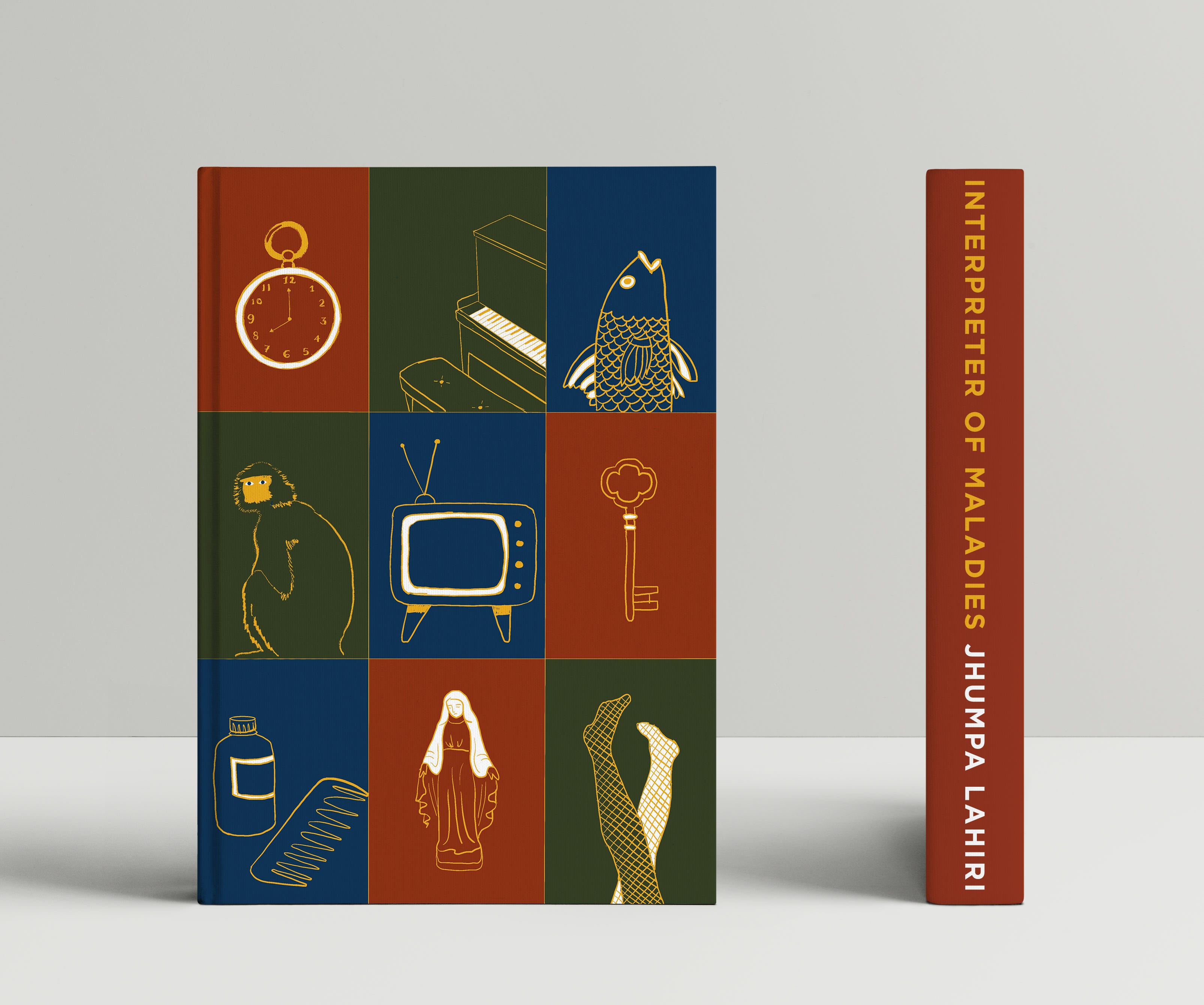
Here is one I was miffed about, because I love the book and its author. Last year, I proposed a cover for a special edition reprint of Jhumpa Lahiri’s Interpreter of Maladies, the 1999 Pulitzer-winning collection of stories about Bengali lives stretched between South Asia and the United States. I drew a grid, nine panels in a mix of blood red, forest green and dark blue, each holding one object drawn in a gold line. Every image is taken from a story inside, so that the cover works as an index of the whole book. The embossed gold lines looked like something devotional, a reliquary for household things, and I loved that a reader who finished the book could come back to the cover and find every panel had become a story they now knew. Alas, the publisher—with whom I have worked a lot—rejected the proposal by pretty much ghosting it. Perhaps it was too literal; perhaps the golden icon style felt too decorative; perhaps a cover with no title is too weird, for something whose job is to make a stranger pick it up.
Rejections are even worse in the case of design competitions. In client work, the refusal at least comes from someone, the dreaded “I don’t think this is working” is the opportunity to start over and propose something different. With competitions, you send the work into a room alongside hundreds of entries, and a few weeks later a name that is not yours appears on the website. You cannot tell why it was rejected, whether it was hated, left people indifferent, or was beloved but not as much as the winner.
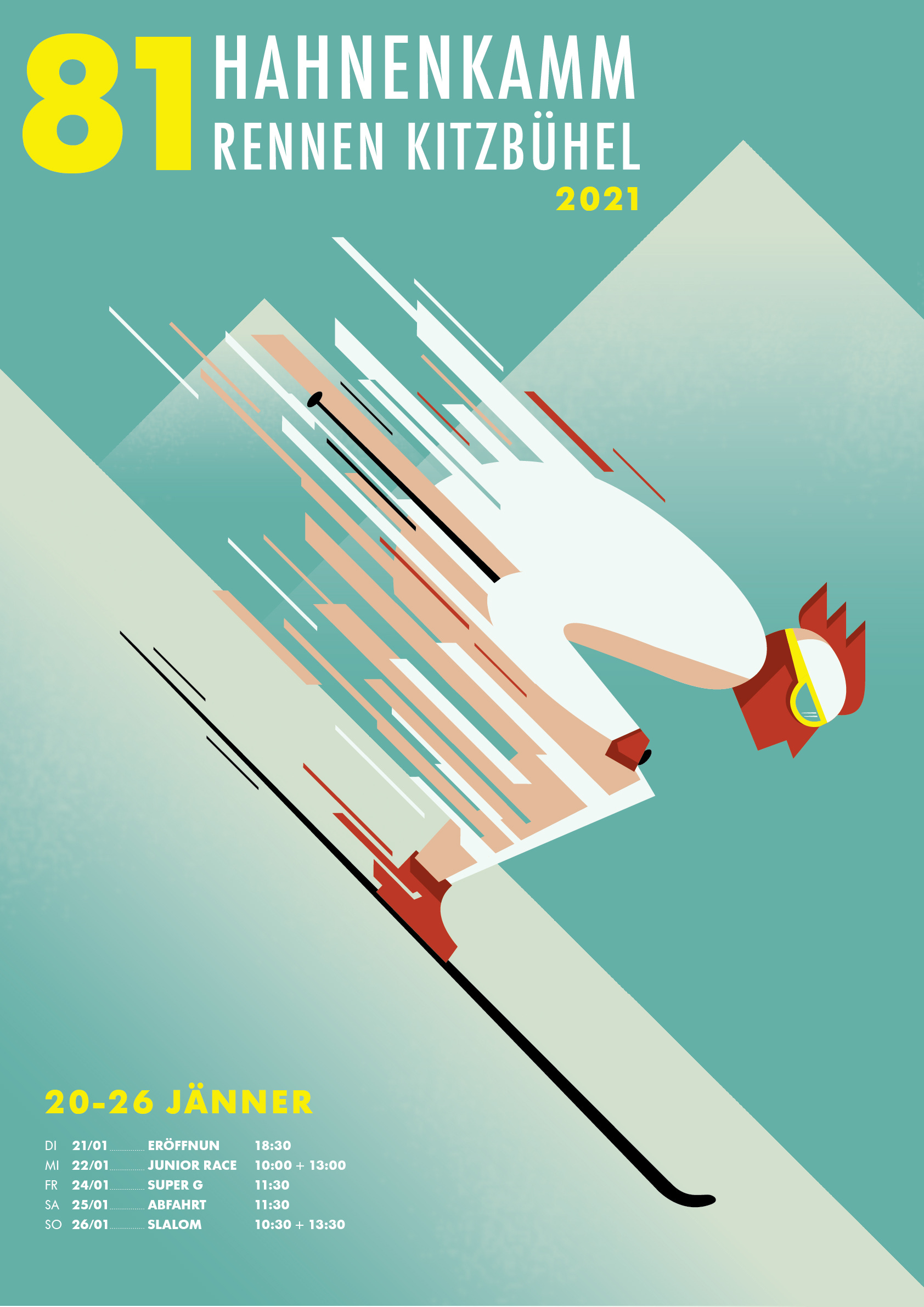
This is one from the competition drawer. It was for the 2021 Hahnenkamm, the downhill at Kitzbühel in Austria, the most feared race on the men’s calendar, where the best skiers in the world throw themselves off a slope into a near-vertical ice sheet at 150km/h. I made a poster of a racer at full speed, everything dissolving behind him into streaks. At the time I was fond of the colours, those cold alpine greens and dusty roses that looked like a 1960s travel poster. I liked the geometry of the composition, it had real velocity in it. Maybe the cartoonish retro palette read as too soft for a race that markets itself on danger. Regardless, I would hurl it down the mountain again.
Once you have seen a few juries from the inside, you understand it as somewhat of a lottery. It is a handful of designers with their own quirks, and trends move through juries just like through the rest of us. There are years when everything that wins is quiet and set in a neutral sans, and years when the same work would be dismissed as timid and the prizes go to the loud. I do not say this to console myself by souring on design contests, but because one should not take juries as gospel. I prefer submitting something, then letting the results wash over me with as much detachment as I can manage, which is never quite enough. I have won some and lost far more, and I am not sure that my winners were better than my losers.
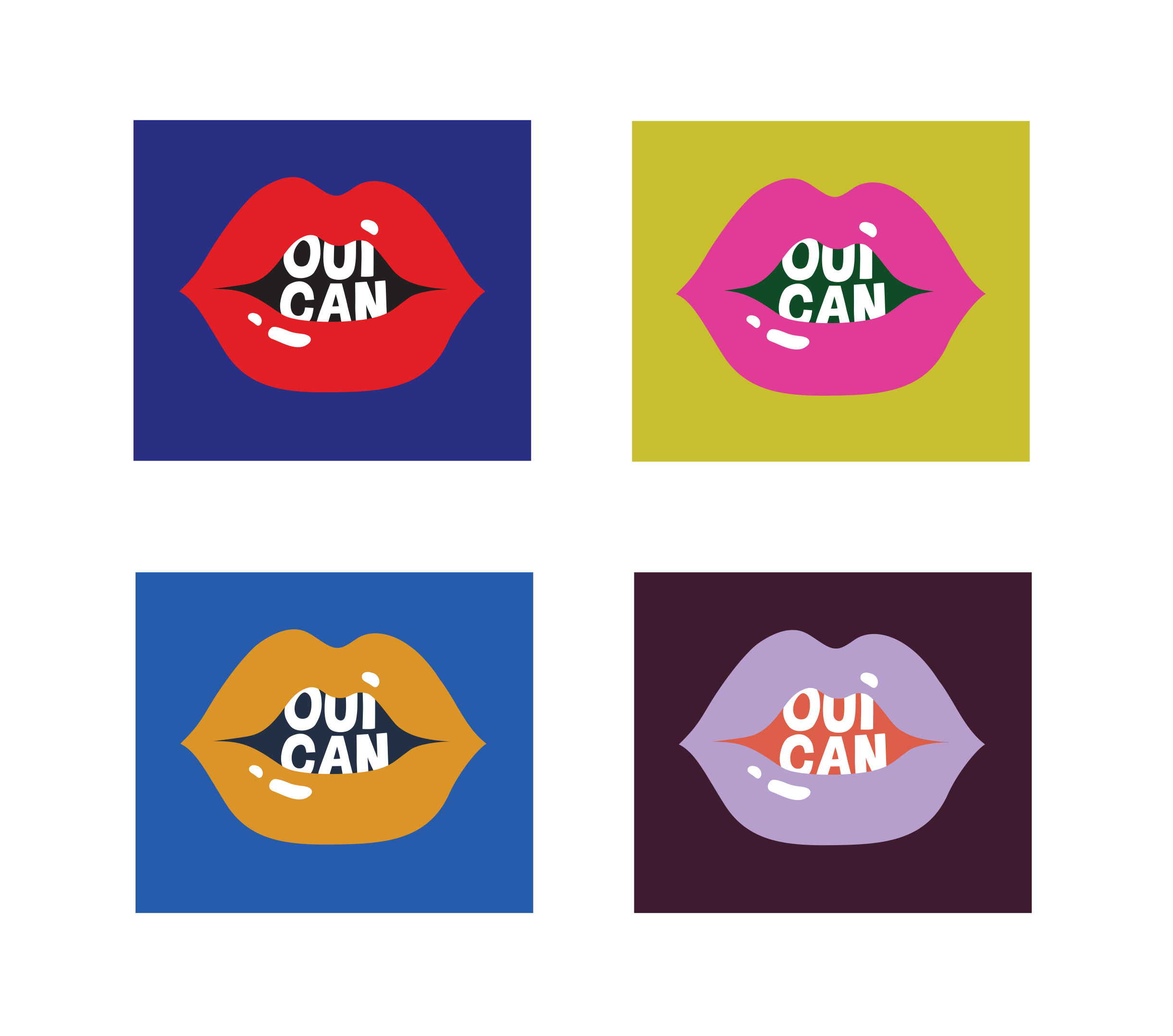
In 2024, the city of Paris ran a competition to design condom wrappers for the Olympics, and the imposed theme was consent. A charming brief, civic and slightly cheeky in the way only a Parisian administration would attempt. I made a glossy open mouth, with the words “OUI CAN” set into it. I thought the bilingual pun and the Pop Art wink worked well in the four colourways the brief demanded, sexy and queer enough for a summer of Parisian love. The jury eventually chose another design that also featured the word “Oui” (I was not that original after all), which featured a sheathed letter “O” a bit on the…nose? Never mind, my mouths are now in the drawer, saying yes to no one.
The designer who takes each refusal as a referendum on their worth has mistaken the natural order of things for a personal attack. Rejections, and failure more broadly, are the ordinary condition of attempting anything. The people we call successful are not those who failed less, but on the contrary those who failed more because they tried more. The cult of success lies about this constantly, so that some imagine that the successful were chosen from the start and spared the drawer. Everyone has a drawer; what varies is whether we can bear to keep filling it, absorbing the steady and unglamorous fact of falling short, over and over again. That famous Beckett quote—“Ever tried. Ever failed. No matter. Try again. Fail again. Fail better”, printed on every slop social media page or on motivational wallpapers in greige offices—speaks to something real. Failure is a normal part of the work, and the sooner you make peace with it, the sooner you can begin to do anything worth failing at.